Create a Chart in Excel: A Quick Guide
Excel, a powerful tool for data analysis and visualization, is widely used across industries. Learning to create charts and graphs efficiently can greatly enhance your data presentation skills. This guide will provide a comprehensive step-by-step approach to help you master the art of chart creation in Excel.
Choosing the Right Chart Type
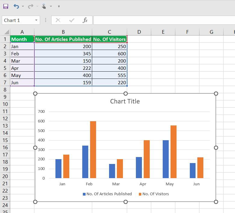
The first step in creating an effective chart is selecting the appropriate chart type. Excel offers a variety of chart types, each designed for specific data visualization needs. Understanding your data and the story you want to tell is crucial in making this choice.
| Chart Type | Description | Best Used For |
|---|---|---|
| Column Chart | Displays data using vertical bars, ideal for comparing values. | Showing sales trends, market shares, or any categorical data. |
| Line Chart | Shows data points connected by lines, perfect for tracking changes over time. | Presenting time-series data, such as stock prices or temperature variations. |
| Pie Chart | Displays data as a circular chart divided into slices, useful for showing proportions. | Representing market share, budget allocation, or survey results. |
| Bar Chart | Similar to column charts but with horizontal bars, great for comparing values. | Comparing product sales, demographic data, or survey responses. |
| Area Chart | Shows data points as filled areas, ideal for emphasizing the magnitude of change. | Depicting cumulative sales, population growth, or revenue trends. |
| Scatter Plot | Displays individual data points as dots, perfect for identifying patterns or correlations. | Analyzing scientific data, stock performance, or any data with two variables. |
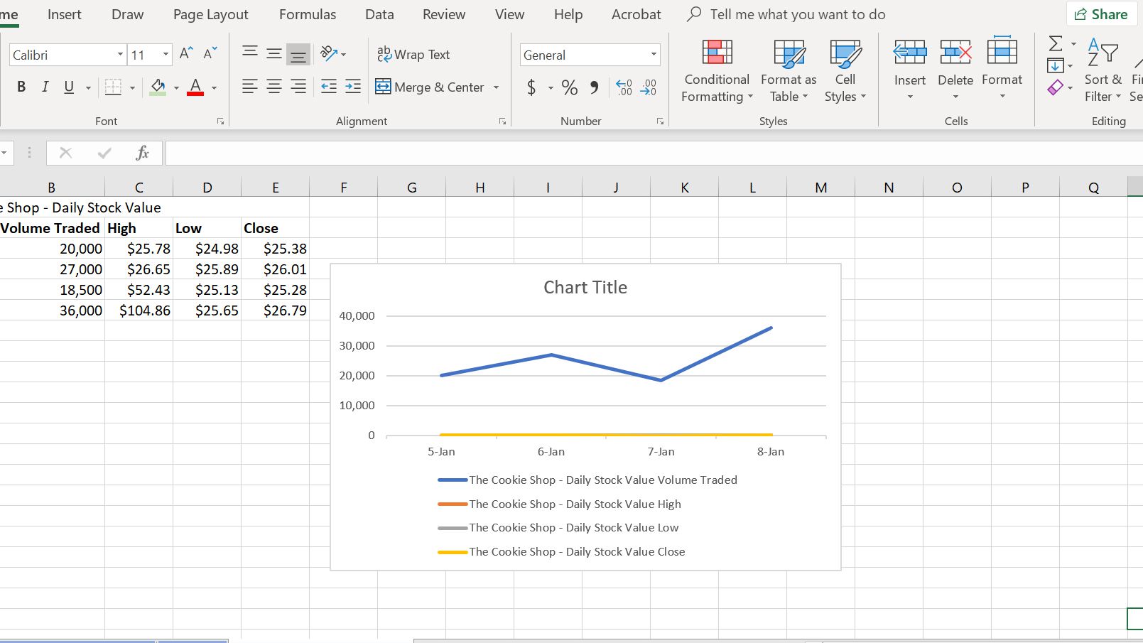
Consider the nature of your data and the message you want to convey when choosing a chart type. For instance, if you're comparing sales figures of different products, a column chart might be the most suitable choice. On the other hand, for tracking the monthly sales trend of a single product, a line chart could be more effective.
Preparing Your Data
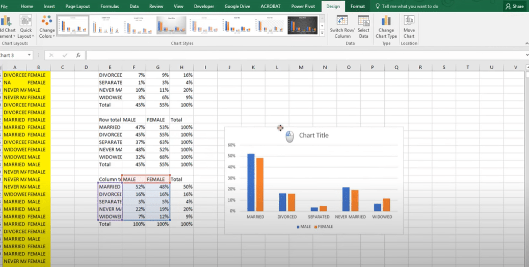
Before creating a chart, ensure your data is organized and structured correctly. Here are some tips for data preparation:
- Clean Data: Remove any unnecessary rows or columns and ensure there are no blank cells within your dataset.
- Consistent Formatting: Use a consistent format for numbers, dates, and text. For instance, ensure all dates are in the same format (e.g., "mm/dd/yyyy").
- Label Rows and Columns: Clearly label your data with descriptive titles for rows and columns. This makes it easier to identify data points when creating your chart.
- Check for Errors: Scan your data for any potential errors, such as incorrect calculations or misspelled labels.
Proper data preparation not only makes chart creation smoother but also ensures the accuracy and clarity of your visual representation.
Creating a Basic Chart
Once your data is prepared, you can start creating your chart. Here’s a step-by-step guide:
- Select Your Data: Highlight the cells containing your data. If your data has headers, ensure you include them in the selection.
- Insert a Chart: Go to the Insert tab on the Excel ribbon and choose the desired chart type from the Charts group. Alternatively, you can use the keyboard shortcut Alt + F1 to quickly insert a chart.
- Customize Your Chart: Excel provides various customization options. You can change the chart type, add titles, labels, and legends, and adjust the data range if needed.
- Format Your Chart: Right-click on different chart elements (axes, plot area, data series) and choose Format to adjust their appearance. You can change colors, add effects, and modify font styles to enhance the visual appeal.
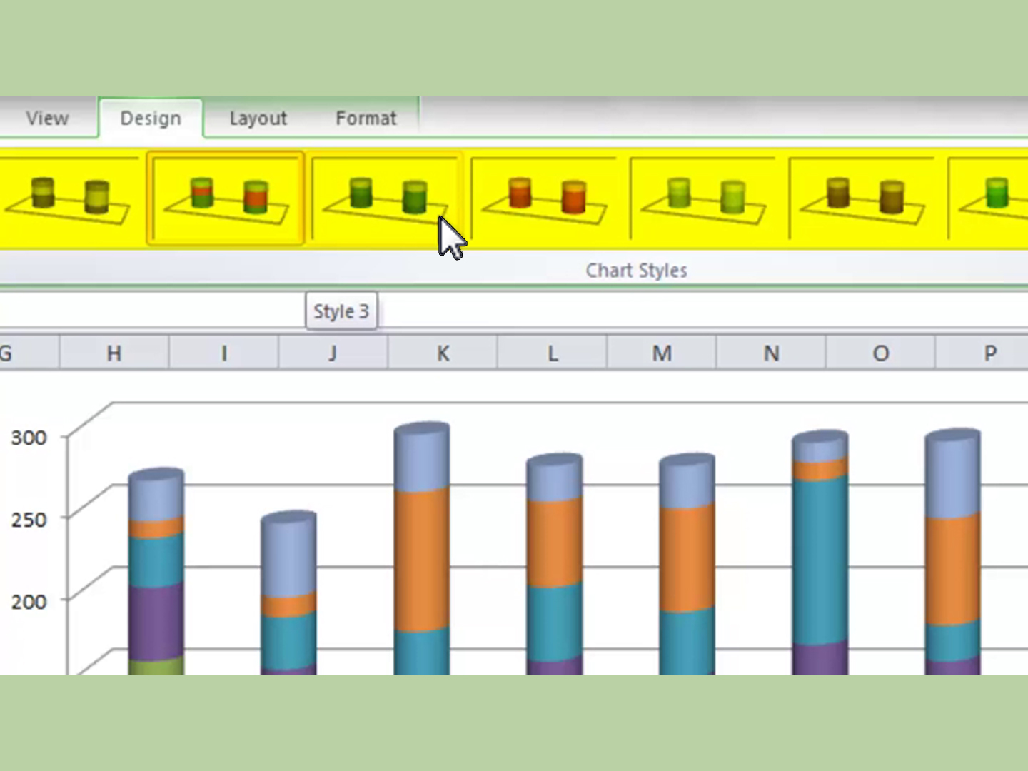
As you work on your chart, Excel's Chart Tools contextual tabs will appear on the ribbon, providing additional tools and options for customization.
Advanced Chart Techniques
Excel offers a wide range of advanced chart features to enhance your data visualization skills. Here are some techniques to explore:
Combining Chart Types
You can combine multiple chart types in a single chart to provide a more comprehensive view of your data. For example, you might add a line chart to a column chart to show both the individual data points and the overall trend.
Creating Dynamic Charts
Dynamic charts allow you to update your data automatically. This is especially useful when working with large datasets or when data changes frequently. You can use Excel’s Chart Tools > Design tab to enable this feature.
Adding Data Labels and Callouts
Data labels and callouts provide additional information about data points. You can add them to your chart to highlight specific values or provide further context.
Using Sparklines
Sparklines are small, simple charts that fit within a single cell. They provide a concise way to show trends or variations in a dataset. You can insert sparklines in Excel using the Insert > Sparklines command.
Best Practices for Effective Chart Design
Creating an effective chart involves more than just choosing the right chart type and customizing its appearance. Here are some best practices to consider:
- Keep It Simple: Avoid cluttering your chart with unnecessary elements. Focus on conveying your data's key message clearly.
- Use Appropriate Scaling: Ensure your chart's axes are scaled appropriately to avoid misleading interpretations.
- Choose Colors Wisely: Use colors that enhance readability and emphasize the data. Avoid using too many colors, as this can be distracting.
- Add Contextual Information: Include titles, labels, and legends to provide necessary context for your audience.
- Consider Your Audience: Tailor your chart design to your audience's level of understanding and familiarity with data visualization.
By following these best practices, you can create charts that not only look professional but also effectively communicate your data's story.
Conclusion: Mastering Excel Chart Creation
Excel’s chart creation capabilities offer a powerful way to visualize and present your data. By understanding the various chart types, preparing your data effectively, and exploring advanced techniques, you can create charts that are not only visually appealing but also highly informative.
Remember, practice is key to mastering Excel's chart creation features. Experiment with different chart types, customize their appearance, and explore Excel's extensive range of tools to create charts that truly bring your data to life.
How do I add a trendline to my chart in Excel?
+To add a trendline, select your chart and go to the Chart Tools > Layout tab. Click on the Trendline button and choose the type of trendline you want to add. You can customize the trendline’s appearance and add a forecast if needed.
Can I create a chart with multiple data series in Excel?
+Yes, you can. When creating your chart, select all the data series you want to include. If your data is organized with each series in a separate column, simply select the entire range of cells. Excel will automatically recognize multiple data series and create a chart accordingly.
How can I change the chart’s data range in Excel?
+To change the data range, right-click on your chart and select Select Data. In the Select Data Source window, you can edit the data range by clicking on the cell reference and dragging to select the desired cells.


