Designing Effective Forms: Checkboxes and Dropdowns
Forms are an essential part of the digital experience, allowing users to interact with websites, applications, and services. When it comes to form design, two common input elements, checkboxes, and dropdowns, play a crucial role in capturing user data efficiently and effectively. In this comprehensive guide, we will delve into the art and science of designing forms with a focus on these versatile input types. By understanding their unique characteristics and best practices, we can create forms that enhance the user experience and streamline data collection.
Mastering Checkboxes: The Power of Choice
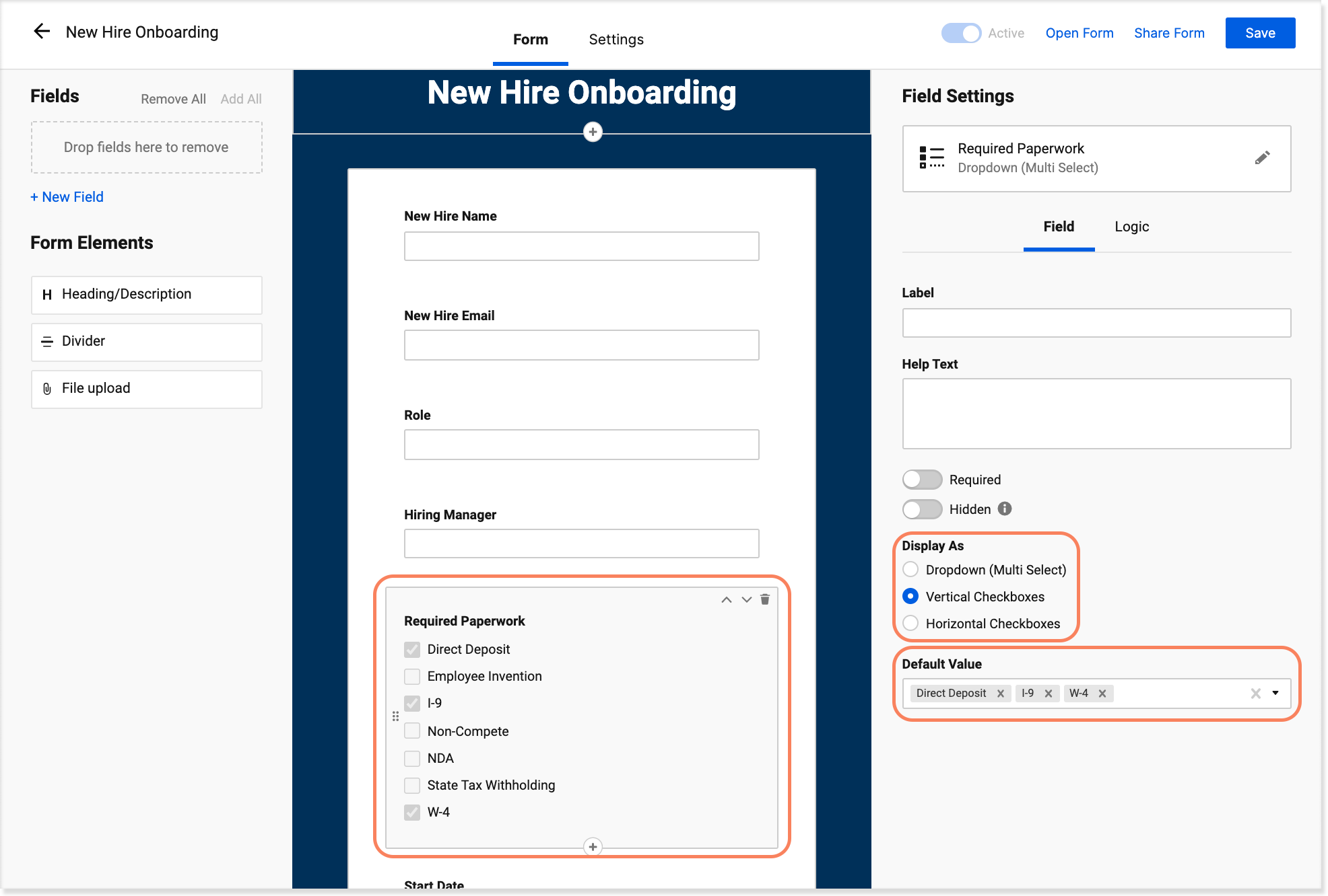
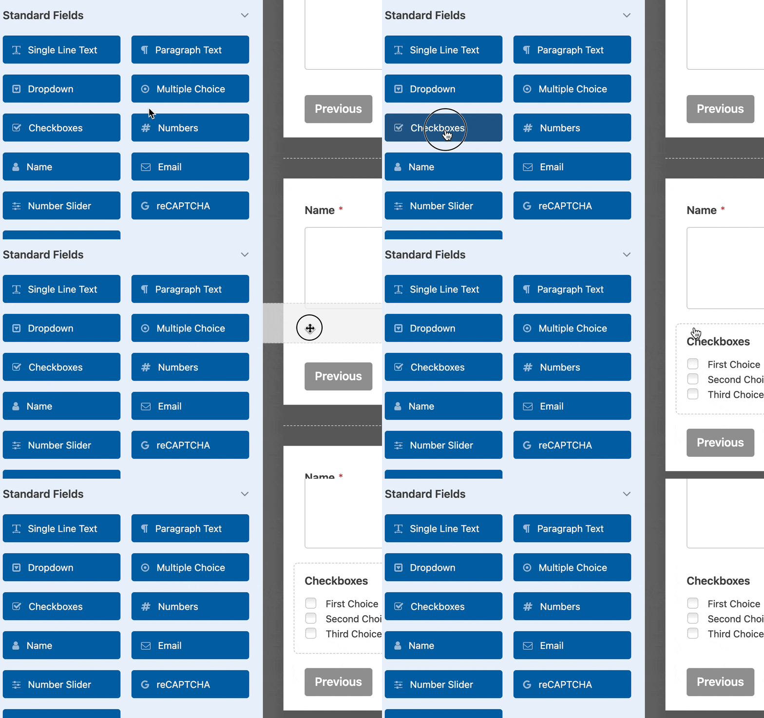
Checkboxes are an invaluable tool for giving users the power of choice. They allow users to select multiple options from a list, making them ideal for preference-based questions or when multiple selections are possible. Effective checkbox design considers several key factors to ensure a seamless and intuitive user experience.
Clear and Concise Labels
The labels associated with each checkbox are critical to guiding users’ selections. Labels should be clear, concise, and descriptive, leaving no room for ambiguity. For example, instead of “Option 1,” consider using a more informative label like “Receive marketing emails.” This approach helps users understand the implications of their choices and makes form completion more straightforward.
Optimal Checkbox Grouping
Organizing checkboxes into logical groups can significantly enhance the user experience. Grouping related options together simplifies the decision-making process and prevents cognitive overload. For instance, in a form requesting user preferences for email communication, grouping options such as “Product Updates,” “Promotional Offers,” and “Survey Invitations” under a clear heading like “Email Preferences” makes it easier for users to make informed choices.
Visual Hierarchy and Spacing
The visual design of checkboxes and their labels is essential for guiding users’ attention. Establishing a clear visual hierarchy ensures that users can quickly scan the form and identify the relevant options. Adequate spacing between checkboxes and labels prevents confusion and improves readability. Additionally, using consistent styling throughout the form enhances overall coherence.
| Checkbox Group | Options |
|---|---|
| Email Preferences | Product Updates, Promotional Offers, Survey Invitations |
| Subscription Type | Monthly, Annual |
| Notification Preferences | Email, SMS |
Default Selections and Pre-filled Values
Checkbox forms often include default selections or pre-filled values to guide users toward specific choices. While this practice can be beneficial, it’s crucial to strike a balance. Overusing defaults or pre-filling too many values may inadvertently influence user decisions or create confusion. It’s essential to use this technique judiciously and ensure that users are aware of the implications of their selections.
Interactive Validation
Interactive validation is a powerful tool for ensuring data accuracy and completeness. As users interact with checkboxes, real-time validation can provide immediate feedback, indicating which selections are required or suggesting related options. For instance, if a user selects “Annual” for subscription type, a message might appear suggesting that they also select “Payment Method” to complete the process.
The Dropdown Dilemma: Simplicity vs. Flexibility
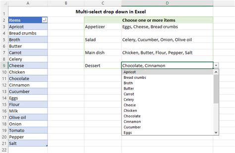
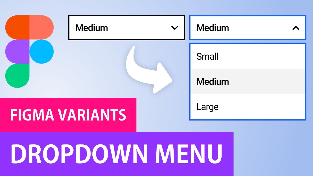
Dropdowns, also known as select boxes, offer a compact and efficient way to present users with a list of options. They are particularly useful when the number of choices is extensive or when space is limited. However, designing effective dropdowns requires a delicate balance between simplicity and flexibility.
Minimizing Cognitive Load
One of the primary challenges with dropdowns is minimizing cognitive load. Users should be able to quickly scan the options and make their selection without undue effort. To achieve this, keep the dropdown concise and limit the number of options to a manageable number. If a dropdown becomes overly long, consider breaking it into multiple steps or using a more appropriate input type.
Search and Filter Functionality
For dropdowns with extensive lists, implementing search and filter functionality can significantly improve the user experience. Allowing users to search for specific options or filter the list based on their preferences reduces the time spent scrolling through lengthy menus. This feature is particularly valuable in forms where users may have a clear idea of the option they are seeking.
Clear and Contextual Labels
Similar to checkboxes, dropdown labels should be clear and descriptive. The label should provide context to help users understand the purpose of the dropdown and the type of information expected. For example, a label like “Select Country of Residence” leaves no room for confusion and guides users toward making the appropriate selection.
Dynamic Options and Dependency
Dropdowns can be made more dynamic by incorporating dependency relationships between options. For instance, in a form requesting user shipping information, the dropdown for “State/Province” could change based on the selected country. This approach simplifies the form-filling process and reduces errors by presenting only relevant options.
Visual Design and Accessibility
The visual design of dropdowns should prioritize accessibility and ease of use. Ensure that the dropdown is clearly distinguishable from other form elements and that the selected option is highlighted or indicated in some way. Additionally, consider implementing a clear visual indicator, such as a small arrow, to signal that the dropdown can be expanded.
Form Validation and Error Handling
Regardless of the input types used, form validation is a critical aspect of form design. Effective validation ensures that users provide accurate and complete data, preventing errors and streamlining the submission process.
Real-time Validation
Real-time validation provides instant feedback to users as they interact with the form. As soon as a user selects an option or fills in a field, validation rules can be applied, indicating whether the selection is valid or suggesting improvements. This approach helps users correct errors immediately, reducing the likelihood of form abandonment.
Clear Error Messages
When validation rules are triggered, clear and concise error messages are essential. Avoid generic error messages like “Invalid Input” and instead provide specific guidance. For instance, if a user fails to select an option in a required dropdown, a message like “Please select an option” is more helpful than a vague error notification.
Progressive Disclosure
Progressive disclosure is a technique that reveals additional form fields or options based on user selections. This approach simplifies the form-filling process by presenting only the necessary fields, reducing cognitive load and potential errors. For example, in a form with a dropdown for “Gender,” the options “Male,” “Female,” and “Prefer not to say” could trigger different follow-up questions, ensuring a more personalized and inclusive experience.
Custom Validation Logic
Custom validation logic allows form designers to implement unique rules based on specific business requirements. For instance, a form might require that at least one checkbox in a group be selected, or that a dropdown option be chosen before proceeding to the next step. Custom validation ensures that forms adhere to specific guidelines and capture the desired data accurately.
User Experience and Form Optimization
Beyond the technical aspects of form design, it’s essential to consider the user experience as a whole. Forms should be intuitive, efficient, and enjoyable to complete.
Mobile-Friendly Design
With the rise of mobile devices, ensuring that forms are optimized for various screen sizes is crucial. Checkboxes and dropdowns should be responsive and adaptable, providing a seamless experience regardless of the device used. Mobile-friendly design considerations include adjusting form layout, font sizes, and input styles to ensure readability and ease of use.
Progressive Enhancement
Progressive enhancement is a design principle that ensures forms are accessible and usable across different browsers and devices. By implementing a basic form structure that works across all platforms and gradually enhancing it with advanced features, designers can provide a consistent and inclusive user experience.
Personalization and Relevance
Forms can be made more engaging and user-friendly by incorporating personalization and relevance. By using data from previous interactions or preferences, forms can present users with options that are tailored to their needs. This approach not only speeds up the form-filling process but also enhances user satisfaction and loyalty.
Usability Testing and Iterative Improvement
Usability testing is an invaluable tool for refining form design. By observing how users interact with checkboxes, dropdowns, and other form elements, designers can identify pain points and areas for improvement. Iterative testing and refinement ensure that forms evolve to meet the needs and expectations of the target audience.
Best Practices for Form Design
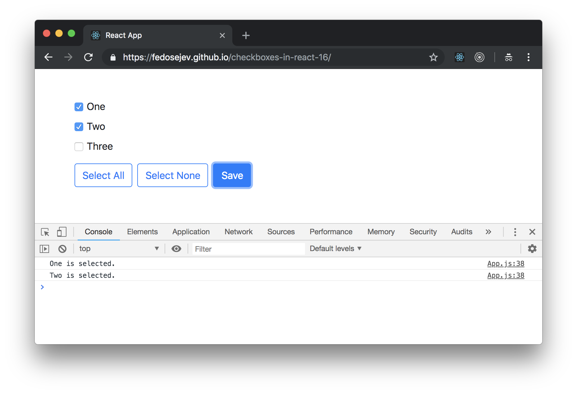
In addition to the specific considerations for checkboxes and dropdowns, several best practices apply to form design as a whole. These principles help ensure that forms are user-centric, efficient, and accessible.
Keep It Simple
Forms should be as simple as possible while still capturing the necessary data. Avoid unnecessary complexity or overly verbose instructions. Keep form fields and options to a minimum, and ensure that each element serves a clear purpose.
Use Clear and Descriptive Language
Form labels, instructions, and error messages should be written in clear, plain language. Avoid jargon or technical terms that may confuse users. Strive for a conversational tone that guides users through the form-filling process without overwhelming them.
Provide Context and Guidance
Users should have a clear understanding of why they are filling out the form and how their data will be used. Provide context through informative labels, tooltips, or help text. Guide users through the form with clear instructions and suggestions when appropriate.
Optimize for Speed
Forms should be optimized for speed and efficiency. Minimize the number of required fields and consider progressive disclosure techniques to reveal only essential information upfront. Reduce cognitive load by presenting options in a logical and intuitive manner.
Accessibility and Inclusivity
Forms should be accessible to all users, including those with disabilities. Ensure that form elements are keyboard-accessible and that screen readers can properly interpret labels and instructions. Provide alternative input methods, such as voice recognition, to accommodate a diverse range of users.
Conclusion
Designing effective forms is an art that requires a deep understanding of user needs, technical considerations, and best practices. Checkboxes and dropdowns are powerful tools in the form designer’s toolkit, offering flexibility and efficiency when used correctly. By following the principles outlined in this guide, designers can create forms that are not only functional but also delightful and user-centric.
Frequently Asked Questions
How many options should I include in a dropdown list?
+The ideal number of options in a dropdown list depends on the context and the expected number of choices. As a general guideline, keep the list to around 7–10 options to prevent cognitive overload. If you have a larger number of options, consider breaking the dropdown into multiple steps or using a different input type.
Can I use checkboxes for single-choice questions?
+While checkboxes are primarily used for multiple-choice questions, they can also be effective for single-choice scenarios. In such cases, consider using a single checkbox with a clear label, indicating that only one option should be selected. This approach ensures users understand the selection requirements.
What is the best practice for mobile form design with checkboxes and dropdowns?
+When designing forms for mobile devices, ensure that checkboxes and dropdowns are responsive and easily accessible. Consider using larger touch targets and ensuring that labels are clearly visible. Additionally, progressive enhancement techniques can help provide a consistent user experience across different screen sizes.
How can I ensure that my form validation messages are effective and user-friendly?
+Effective validation messages should be clear, concise, and action-oriented. Instead of generic error messages, provide specific guidance on how to correct the issue. Use a friendly tone and avoid technical jargon. Additionally, consider using visual cues, such as highlighting the field in red, to draw attention to the error.


